17 December 2022

Marketing Micro.Blog

TL;DR: Manton Reece (creator of Micro.blog), and Daniel Jakut (creator of MarsEdit, Mac software for posting to webblogs, including Micro.blog), recently discussed, on their long-running Core Intuition podcast, how Manton could better market Micro.blog and gain more users during the mass-exodus from Twitter that has followed Elon Musk's acquisition and mismanagement of the platform. My top advice is:
  1. Rely more on viral and (incentivized) referral marketing than on paid advertising.
  2. Go after authors and other (professional) writers, who seem like a perfect fit for the platform
  3. Create specific material for people thinking of switching from Twitter to Mastodon, explaining the relationship between Micro.blog, Mastodon, the Fediverse and Twitter, and emphasizing what's different about Micro.blog.
  4. Make the client software more obvious on the Micro.blog website; at the moment they're kind of buried in the Help pages.
  5. Before you even consider paid marketing, analyse your existing sign-up, conversion and usage data and get set up to do that consistently. If you don't have historical data, start capturing it immediately: history starts with your oldest data (as my friend, David Townsend, taught me).
  6. If you do paid advertising, consider not giving incentives as part of the promotion; if you do give discounts, be careful interpreting the results of the campaign.
  7. Be aware of negative effects in marketing (which, although relatively unlikely in your case, are more widespread than is commonly accepted). See

Background

Micro.blog is an excellent Twitter alternative (inter alia) created by Manton Reece, who is a deep thinker about social media, and has written book about Indie Microblogging. Micro.blog was launched in 2017, as both a blogging platform (with a particular, but non-exclusive focus on title-less, “microposts”, as well as full blog posts), and has expanded to include hosting podcasts, photos, “book shelves” and more.

Micro.blog is a first-class member of the Fediverse, in the sense it supports ActivityPub, meaning that you can follow and be followed by Mastodon users from Micro.blog. Manton deliberately eschews many of the Twitter features that Manton thinks have contributed to its becoming a toxic platform from many users. For example, it has no equivalent of retweeting, does not encourage use of hashtags, does not use an algorithmic timeline, does not show the numbers of followers and account has, does not carry advertising, and has active community management, with Jean MacDonald (@jean@micro.blog) employed as its community manager.

Micro.blog has an open API, allowing people to create accounts and post without paying, and also to link one or more external blogs to Micro.blog, but most users subscribe either to its $5/month hosted microblog plan, or its $10/month Micro.blog Premium plan, which includes podcasting, video, bookmarks and (sending) newsletters.

It's slightly ironic that I am not, in fact, a very active user of Micro.blog, for somewhat obscure reasons, but I am an enthusiast for the platform and have followed its development and growth since before the Kickstarter campaign Manton used to launch it. (The reason I don't use it much as is that I've been taking advantage of its open nature as a way to allow to experiment with hosting a microblog and blog on my own weird tag-based database, microdb, and because I don't work much on that, posting to it is actually a bit of palava for me. I also, already, have blogs on way too many platforms (e.g. this Scientific Marketer Blog on Blogger, the Test-Driven Data Analysis Blog on Github Pages (with Pelican), various List blogs and prose blogs on Eric Bower's fascinating list.sh and prose.sh, SSH/PKI-based platforms under the pico.sh umbrella. All of these effectively syndicate through my micro.blog/njr account.) (Pretty good that you call do all that, huh?)

Marketing Micro.Blog

On Episode 541 of Core Intuition, Manton and Daniel discussed how to market Micro.blog, and mentioned that their community manager, Jean MacDonald, always emphasizes that, if they do, they need to measure the impact (which is obviously right).

As someone who has worked a lot in marketing (not the adtech, surveillance capitalism kind, but the sort of direct marketing most businesses need to do), I have thoughts. Here I'll expand on the TL;DR above.

  1. Viral and (incentivized) referral marketing. Social media is viral by nature, and current (active) users are generally the best ambassadors for the platform. I would have thought that further encouraging members to promote the platform by giving them discounts (probably free months/credit on their plan) when someone else signs up for a paid account would be a highly efficient way of using the existing community. I suspect the incentive would not have to be a lot: a single extra month on whatever plan you're on if someone signs up using your code seems plenty.
  2. Go after authors and writers. There was some talk on the podcast about celebrities like Elton John, and Manton commented that there are no music-related features on the platform (though as Daniel keeps pointing out, it wouldn't take much to extend bookshelves to record shelves, film shelves etc.)

    But Micro.blog does have a special focus, it seems to me—writing and books. First, unlike Twitter and Mastodon, there is no limit to post length on Micro.blog. If you go past the maximum micro-post length (280 characters), only the first part is shown and you have to click a link to see the full post; and full blog posts with titles just show as links in the timeline. But despite the name, Manton absolutey sees Micro.blog as a full-blown blogging platform. (This confused me for ages, and the name still seems odd, to me, for a platform that supports micro-posts and full blog posts; but naming is hard.)

    More than this, Manton loves books, has built a special Bookshelves feature for tracking what you're reading. Manton has also added the ability to send out your posts as email newsletters, as well as publishing them to the web.

    It seems to me that the ideal people to attract to Micro.blog are writers. I don't know what the best way to do this is, but probably just reaching out to some (and probably offering free accounts, I guess) would be a great start. If a few (more?) novellists, poets, and essayists joined the platform, I would have thought that would both further raise its tone and potentially attract many of their readers.

  3. Create specific material for people thinking of switching from Twitter to the Fediverse. Unsurprisingly, there is a help article on Micro.blog called What’s the difference between Micro.blog and Twitter? That's great, and is needed more than ever. But there's not an article called What’s the difference between Micro.blog and Mastodon? I think creating one is important, ideally emphasizing many of same things as the article contrasting with Twitter does, but also more specifically highlighting the significant differences between Mastodon specifically, and the Fediverse more generally, while simultanously getting the message across that you can be a first-class participant in the Fediverse on Micro.blog.

    And of course, that help article shouldn't just be buried in the help: it should be a blog post, linked from the front page, and promoted to high heaven, especially to all the people now writing articles about Mastodon and the Fediverse. (And writers!)

  4. Highlight the client software more. Although it wasn't hard to find, I was slightly surprised, today, how long it took me to find the Mac client for Micro.blog, which I didn't have on the particular machine I'm writing on. It isn't in the Mac App store (which is fine), but it also isn't (I think) mentioned on the front page of the site, isn't very prominent in the help, and when you log in on the web, there isn't even an understated call to action suggesting you might want to try a native client.

    This is true on mobile too.

    While there's nothing wrong with using Micro.blog through a web browser, many (most?) people choose to interact with it, as with other social media platforms, through a client app. And there are lots. (Two of Manton's commendable attitudes are (1) that he is a huge enthusiast for the web in general, and the indieweb in particular, and (2) that he is deeply committed to letting a thousand client flowers bloom, and doesn't privilege the apps Micro.blog itself produces.)

    But it wouldn't hurt to let people know.

    It's not like they're trying to hide it. There's a great (anchorless) section of the Micro.blog help site highlighting (at the time of writing) nine apps you can use with the service. But you have to go looking.

  5. Measure before you market. As noted above, Jean apparently encourages Manton to put in place good measurement before embarking on (paid) marketing, which is obviously sound advice. As much of the content in other articles on this blog emphasize, these measurements are quite hard, but important.

    Possibly less obvious is that you need a good baseline set of measurements before you start. Micro.blog may already track sign-up rates (for trials), conversion rates, upgrade rates, retention (renewal rates)/churn etc., but I don't ever really remember hearing Manton talk about it on Core Intution, so possibly not. Even if no one at Micro.blog already does this, I would think there's a good possibility enough data is kept to be able to analyse many of these things retrospectively. I would strongly recommend building at least basic stats for these things and going back and graphing them over the whole history of the platform if possible. This will (a) be useful in itself and (b) set the company up for measuring marketing more effectively. (Needless to say, the measurement should be ongoing and ideally automated to produce some kind of report or dashboard, either on-demand or as something computed routinely.)

  6. Be careful with incentives. I am definitely not advising against paying for promotional marketing; but I am suggesting that there will probably be a better return on investment from all the things above for lower cost than any likely ROI on direct/promotional paid marketing. If Micro.blog does decide to do promotional marketing—for example, by sponsoring podcasts, as discussed on the show—there are two important things to bear in mind:
    • Even if you use a code to track where people came from, that does not prove that they are incremental sign-ups or sales. Of course, it's quite strong evidence (and even stronger evidence that they probably heard the promotion), but some people will (do!) use promo codes who would have bought anyway.
    • This is particularly true if the promotion comes with some kind of discount or incentive—a 30-day instead of a 10-day trial; 12 months for the price of 10; whatever. For example, if someone I know wants a cloud-based server, I will definitely direct them to Linode (because they're excellent), but I'll point them to one of podcasts with codes offering $100 free credit, because: well, why not? This is fine: I'm sure Linode is happy to give people the $100 to sign them up, just as I'm sure Manton is happy for them to get a discount. But it does affect the measurement of incrementality, and the bigger the incentive (and the $100 from Linode is huge), the more likely it is to affect assessment of incrementality (and, therefore, ROI).
    So if the purpose of the code is to track where users come from, a discount is double-edged: it makes it more likely people will use the code, but also makes the inference you can make from that use less strong. It also slightly biases things towards people who might not really want to pay the full price (though, to some extent, that's just human nature.)

    Needless to say, having good historical measurements allows you also to offset some of this, because if signups are fairly steady you should see the aggregate effect of promotional marketing.

  7. Be aware of negative effects. My final caution probably isn't highly salient for Micro.blog, but is important for all marketers to understand: marketing can, and does, have negative as well as positive effects. Unfortunately, there's an Upton Sinclair aspect to this:
    “It is difficult to get a man to understand something, when his salary depends on his not understanding it.” — Upton Sinclair, I, Candidate for Governor: And How I Got Licked.

    Marketers tend to assume that the worst that can happen in a marketing campaign is that it costs money and has no impact. In fact, the truth is much harsher: it is perfectly possible to spend good money to drive customers away. In fact, it's common. Usually, there's a mix, with a few people being put off, and more people being turned on, so that there's a net benefit. It takes fairly inept marketing to generate a net negative effect in overall behaviour.

    One case, however, where this is extremely common is retention activity. I've written about this extensively, for example in this paper on churn reduction in mobile telephony. The basic gist is that people who leave are generally getting poor value for money, poor service, are not using the product or have had a bad experience: often they remain paying customers mostly out of apathy, laziness or because they don't realise they're out of contract. Calling them up and offering them the chance to lock in again often acts as a catalyst for cancellation. (“Really? I'm out of contract. Does that mean I can cancel right now?”) I'm not for a moment suggesting there are hoards of Micro.blog customers only paying subscriptions because they've forgotten about them or can't remember how to cancel. But you never know: there might be a couple!

Labels: , , , , ,

01 January 2016

Naming Photos with AppleScript and Python in Photos.app on OS X

I started using Apple’s Photos App a few months ago, and am quite impressed with it. But it has a few issues for me.

My long-established workflow consists of

  1. shooting raw files
  2. sorting and discarding most of them in Adobe Bridge
  3. converting the better ones to JPEGs and adjusting as appropriate in Photoshop
  4. naming the files containing the photos with a suitable CamelCase titles
  5. storing photos in hierarchical directories with names reflecting dates, locations and events
  6. importing the resulting folders into iPhoto for viewing, syncing etc.

This produced what are now referred to as iPhoto events with reasonably useful names, and I could search on the filename.

Importing things into Apple Photos created a couple of problems.

  • The iPhoto events are all relegated to albums inside and iPhoto Events folder.
  • The photo (file) names, while searchable on OS X, are invisible except through the metadata viewer; on iOS they’re completey invisible.

Obviously, the filename is not really the right place to store the title, especially if, like me, you’re a command-line guy who is allergic to spaces in paths (hence CamelCase). So it seems natural to want the file names to get promoted to photo titles in the EXIF data, preferably converted from CamelCase.

Ideally the way I’d like to do this is just to write a script, preferably in Python, to go through and set this. But how to do that once the pictures are ghetto’d inside the Photos App? I could set them externally and reimport them all, but that didn’t seem ideal, especially since I’ve invested in a fair amount of album structure. So the alternative is to try to script this change while leaving the photos in the app. But again, how?

There seemed to me to be two main possibilities. The first was to use whatever API’s Apple provides to photos in the Photos App to make the change using either Objective C or, more likely today, Swift. The other possibility was to see whether AppleScript could help, probably linking to a shell script or Python script or similar.

Problem #1: Apple’s App Names are Almost Unsearchable

In some ways, it’s hard to argue with Apple’s new app naming policy: rather than old-style names like iPhoto, iCal, iMessage, it now simply calls them Photos, Calendar and Messages. (Will Safari become Web and iTunes become Music?) This is commendably straightforward, but makes searching for information about these applications remarkably hard. Obviously searching on “Photos” is hopeless, but “Apple Photos”, “Apple Photos App” etc. are not that much better, because the names are too generic. Even searching Apple’s own Developer site for information about interfacing to the Photos App is hard, because there are too many references to photos (and Apple, and App) most of which are not to do with the Apple Photos App. Just as some techies talk about Mail.app, you can talk about Photos.app, but it only really helps if people have described it as that; and most don’t.

Anyway, the result is I gave up looking for information about how to access photos in the app from Swift.

Problem #2: AppleScript

I have never really used AppleScript. It looks like a toy language that’s trying a little too hard to look like natural language. And whenever I start reading Apple’s documentation on AppleScript I struggle to find anywhere that it succinctly describes how to use it.

But today, I found two things that help a lot. The first is how you find out what AppleScript functions are available in an application. It turns out, you do this:

  1. Open Script Editor
  2. From the File menu, choose Open Dictionary...
  3. Pick the app you are interested in from the list (in this case, Photos) …

… and lo, you will be presented with a list of functions you can use with that App. This helps considerably.

The second thing that helped me tremendously, was a useful cheat-sheet for AppleScript. Aurelio Jargas has a page AppleScript for Python Programmers (Comparison Chart) which very succinctly lists the basic hundred-odd things you need to know about AppleScript. This is great. The fact that it translates from Python especially convenient for me, but they key thing is that it translates between AppleScript and almost anything else mainstream.

So I present this photonames.scpt:

set basecmd to "python /Users/njr/python/misc/decamel.py \""
tell application "Photos"
    set N to count media item
    repeat with i from 1 to N
        if name of media item i is in {missing value, ""} then
            set cmd to basecmd & filename of media item i & "\""
            set newname to do shell script cmd
            if newname ≠ "" then
                set name of media item i to newname
                say newname
            end if
        end if
        if i mod 10 = 0 then
            say i
        end if
    end repeat
end tell

This isn’t very hard to follow, but I’ll talk through it:

  1. The first line sets a variable, basecmd to the start of the shell command I want to run to work out the picture name. I’ve written a small Python script to do this, called decamel.py, which gets passed the filename in double quotes. basecmd includes the open quote, which is escaped with a backslash.

  2. In AppleScript, whenever you want to use AppleScript functions from an application App, this needs to be in a tell application "App" block, hence `tell application “Photos”

  3. The next line sets N to the number of items in the library. (media item is the class of objects in the application to be counted.)

  4. The repeat line is a for loop (AppleScript indexes from 1)

  5. The items in the library can be accessed by number (media item i). Braces {...} are used to enclose ordered lists, and missing value is AppleScript’s null. So this condition restrict us to operating only on photos whose name is set and non-empty.

  6. String concatenation is performed with & and filename of media item i is the filename (excluding the directory) of the ith photo. So the next line sets cmd to the command we want to run.

  7. We run assign the output of running the shell script to newname

  8. If that result was was non-empty (note the not equal operator ), we assign the name of the photo to the result of running the script.

  9. I haven’t yet found a way to get the script simply to show what it’s doing by printing to stdout or stderr (it can pop up dialogue boxes, but that’s the last thing I want). But I can get it to speak, so slightly oddly I get it to speak any new titles it assigns using the say command. This is quite slow, but quite effective and fun. Obviously, delete that line if you don’t like it.

  10. The lack of an easy print function also makes progress reporting hard. Again, I decided to get it it speak its progress. So the final conditional gets it to speak the number it has processed after every tenth photo. Obviously, adjust that 10 for less (or more) frequent progress reporting.

That’s it, apart from the Python.

The Python Script is very simple. It just has to know how to recover spaced words from CamelCase. This does it.

# -*- coding: utf-8 -*-
import sys
import unittest

prefixes = (u'img', u'image', u'dsc', u'cnv')

def decamel(utf8):
    camel = utf8.decode('UTF-8')
    lc = camel.lower()
    for prefix in prefixes:
        if lc.startswith(prefix):
            return ""

    lastIsUpper = True
    words = []
    word = u''
    for i, c in enumerate(camel):
        if c == u'.' and lc[i:].lower() in (u'.jpg', u'.jpeg'):
            break
        elif c.isupper():
            if lastIsUpper:
                if word == u'A':
                    words.append(word)
                    word = c
                else:
                    word += c
            elif word:
                words.append(word)
                word = c
            lastIsUpper = True
        else:
            lastIsUpper = False
            word += c
    if word:
        words.append(word)
    return u' '.join(words).encode('UTF-8')


class TestDeCamel(unittest.TestCase):
    def testDeCamel(self):
        cases = {
            'IMG001.jpg': '',
            'IMAGE0001.jpg': '',
            'img': '',
            'image': '',

            'OneTwo': 'One Two',
            'oneTwo': 'one Two',
            'OneTwo.jpeg': 'One Two',
            'oneTwo.JPG': 'one Two',
            'ABird': 'A Bird',
            'SongForABird': 'Song For A Bird',
        }

        for orig, result in cases.items():
            self.assertEqual(decamel(orig), result)


if __name__ == '__main__':
    if len(sys.argv) == 2:
        arg = sys.argv[1]
        if arg in ('-h', '-help', '--help'):
            print '\nUSAGE: python decamel.py UTF8-filename\n   or:'
            print '       python decamel.py (to run tests)\n'
        else:
            print decamel(arg)
    elif len(sys.argv) == 1:
        unittest.main()
    else:
        print ""

As you can see, there are a few exclusions: it doesn’t construct a title if it looks like the filename comes straight out of a camera or scanner. You may need to adjust this if you have files with different automatically generated names. It turns out I hadn’t realise I have a few with names like PictureNNN.JPG and a few more with names like 011_11.JPG etc., so I would probably have been better to use a list of regular expressions rather than prefixes, but this was a 98% solution for me.

Labels: , , ,

05 November 2015

Test-Driven Data Analysis (New Blog)

I've just launched a new blog, in collaboration with star Stochastic Solutions customer Skyscanner. It's available at http://www.tdda.info and is entitled Test-Driven Data Analysis. It will cover a lot of topics that would otherwise have been covered here, but with a specific focus on quality in data analysis, with ideas inspired by the test-driven development methodology.

Head over to the Test-Driven Data Analysis Blog to subscribe up by feed or email.

I'll also be be tweeting when there are new posts (and no doubt, about other stuff as well) from the new @tdda0 Twitter account. Get 'em while they're hot!

12 July 2015

Do Fitness Trackers Work? (Very Nearly) 23 Months the Misfit Shine

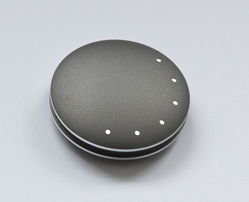
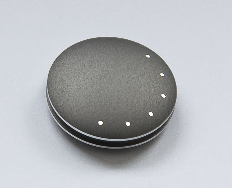
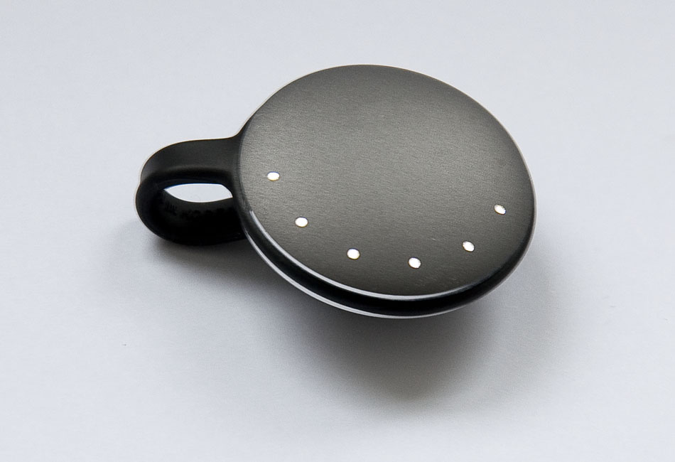
Very nearly two years ago I received a Misfit Shine, a rather beautiful fitness tracker from Misfit Wearables. The Shine resulted from a highly successful Indiegogo project, and I have written about it previously here and here.

The Misfit Shine
The Misfit Shine

Nearly two years on, my Shine has just died, so I thought I’d write up some thoughts on fitness tracking in general, and the Shine in particular, ith the benefit of nearly two years of use.

Can Fitness Trackers Change Behaviour? Do Fitness Trackers Change Behaviour?

Everything I read about fitness trackers suggests they have a high abandonment rate and that many people find they lose motivation to move more after the first few weeks of novelty wear off. That hasn’t been the case for me. My experience is that the Shine has been extremely effective at making me move more (primarily, walk more), and that effect has increased over time. I’m pretty convinced that whether it works depends primarily on whether the user takes the goal seriously or not.

I left the goal at the default 1,000 points a day. This seems to equate almost exactly to 10,000 steps a day, which is the widely endorsed minimum amount people should walk (e.g. NHS, Horizon). While I’m not the most active person, I always thought I walked quite a lot. Nevertheless, for the first week or two, I quite often found that by the middle of the evening I wasn’t all that close to 1,000 points, and clearly wouldn’t hit the goal without specific effort. Perhaps this shouldn’t be too surprising: when I got the Shine, I worked from home (behind a computer) and didn’t have any need to move more than 2,000–3,000 steps a day. But I was convinced that 10,000 steps a day is a pretty small amount for a human to move, and that if I was failing to reach that, this was probably a very bad thing. So whenever it looked as if I would miss the target, I’d go for a walk. sometimes for as long as an hour if it had been a particularly indolent day. As a result, I hit the minimum the vast majority of days, and probably averaged about 100,000 steps per week.

Conclusion 1: It can work, and for me it did work. My behaviour clearly changed as desired: I started hitting 10,000 steps or more very nearly every day. The key, for me, was a combination of (1) measuring it (2) believing it mattered (3) being committed to doing something about it if it looked as if I was going to miss on any day.

Take the Long Way Home: Changing the Objective Function

There’s a rather lovely story about a visit to London by Gandhi. He was escorted by a bright young man from the Foreign Office who said to the mahatma:

“If we go through this way we will save a minute”,

to which Ghandi replied

“But what then, young man, will we do with the minute?”

In the modern world, it seems we are all constantly trying to save time. We cut corners, take short-cuts, avoid traffic lights, eat fast food, attempt vainly attempt to multi-task; we “cut to the chase”, avoid “paralysis by analysis”, snd msgs in ncmprhnsbl txt-spk, use TLAs (and xTLAs) and increasingly compress our thoughts to 140-character tweets. And we do these things largely unthinkingly, literally without even being aware of them in most cases. Not everyone does it, of course: there is the slow food movement, and a woman I knew slightly once said that she liked travelling “as far a possible, as slowly as possible”, which was such as strikingly unusual formulation that I still remember it (and her) a quarter of a century later. But still …

When I started measuring my movement, I found myself repeatedly thinking something I suspect I’d never thought previously: rather than taking the quickest route, I could take a long route to wherever I was going. (I guess I should have taken Supertramp’s advice sooner.) Without dwelling on it too much, I think this is fascinating. In effect, by “quantifying myself”, as the lingo has it, I changed my subconscious objective function from “minimizing time” to “maximizing walking”; or more accurately, not—obviously—maximizing walking, but at least selecting from among the reasonable alternative routes the one with the most walking rather than the least.

Real-Time Information and Staying Ahead of the Bus

During the time I had the Shine, I changed from working alone, from home, to employing a couple of people and working in an office in Edinburgh. I live about 8 miles south of the centre, so walking in isn’t a practical option, so I got a bus pass. There’s an excellent bus service from near my house to near the office (the Lothian 31/X31), so I use that. I don’t really mind the 30–40 minutes on the bus, not least because I use it mostly to continue development of Miró, which I continue (only half faceciously) to call “the world’s only analytics package developed primarily on public transport”. For the first few weeks, I boarded the bus at the nearest stop to my house, and disembarked at the last stop on North Bridge; the stop in front of Waverley Station is probably closer, but the time the bus waits at the lights to turn onto Princes Street means that I probably reduce my overall travel time by walking from North Bridge, “saving time”, like a good little human optimizer.

Then things then changed.

I’m not a very patient person. In fact, I’m an extremely impatient person. And I hate waiting for buses. Happily, however, a few years ago Lothian Buses introduced a real-time bus tracking information service, with digital displays at some bus stops and phone apps that give pretty reliable information about the time to the next bus. In the centre of Edinburgh, bus stops are remarkably close together. The combination of the reliability of the real-time bus information and the closeness of stops means that my rule-of-thumb is that if there’s more than 3 minutes to go until the bus is due, I can safely walk to the next stop and still catch the same bus. So I do. There’s a double win here: I avoid the mind-numbing tedium of waiting for a bus and I walk more, with no cost at all in terms of my total journey time (including waiting).

But there’s more. It turns out that between North Bridge, where I get on the bus to go home, and Lady Road, about 2 further south, the average bus speed is less than twice my walking speed. As a result, if I get to the bus stop and it shows 10 minutes till the next bus is due, I can probably walk for at least 20 minutes, often more, until the bus catches me. In fact, I often make it all the way to Lady Road without the bus catching me, and I’ve yet to miss a bus as a result of this tactic. (Slightly disconcertingly, in the centre, the bus speed is not always faster than walking, so its far from uncommon for the time indicated at each bus stop I pass to increase as I march south for the first few stops.)

I find this remarkably interesting too. For my whole life, without really thinking about it, I’ve effectively optimized for “walking as little as possible” when using buses. But now, simply by consiously changing this approach to trying to get home “as fast as possible”, but qualifying this by saying “and walk as much as is consistent with that”, my activity has changed almost beyond recognition. Small nudges, indeed (a book, I should say, I haven’t read).

Don’t Walk; Walk

Walk - Don't Walk Lights - Washington DC

The third change in my behaviour I’ve observed since getting the Shine has been to start getting off the bus earlier, particularly on the way into work. Unlike walking ahead of the bus and letting it catch up, this isn’t “free”: the result is that I get into the office slightly later than I otherwise would. (And get wetter, if it’s raining.) But even here, it isn’t as bad as it seems. I tend to get off around the Queen’s Hall, and walk to Forth Street, which gives me a 1.3 mile walk rather than a 0.5 mile walk, so I that probably costs me 12 or 13 minutes gross. But, as mentioned before, the bus doesn’t go that much faster than walking pace in town. So in fact, I think I probably only add about 5 minutes to my journey by getting off nearly a mile earlier.

Behaviour Changed

Overall, over the 23 months for which I used the Shine, I made my daily goal very nearly 100% of the time. I don’t have the full stats for the two years, but I had a number of runs of 60–90 consecutive days making the goal, frequently hit 150% to 200% of the daily target, and would often go weeks at a time without dropping below 150% of target. Of course, your mileage may vary (literally!)

Conclusion: To Replace or Not To Replace

For me, there’s no question the Misfit Shine worked. It is a beautiful, minimalist, but very effective step counter. By caring about achieving the (admittedly modest) goal I set, it definitely succeeded in getting me to move significantly more than I had been doing. I’m sure lots of other fitness trackers would have performed similarly, though it helped that the Shine is attractive to wear, has excellent software and is backed by a company whose people are consistently helpful. It’s not a perfect device by any means. Among its weaknesses, it is very losable, and I’m not convinced it’s accurate for tracking other activities like cycling and swimming. Syncronization with the phone was always a hit-and-miss process for me, though this was more annoying in the early days, when you had to sync manually, than more recently, since they updated the app to sync in the background periodically. (Synchronization uses Bluetooth Low Energy, and I guess that is made more difficult by the Shine’s very elegant, nearly all-metal case.) Despite these small niggles, the Shine is excellent at its primary function.

So will I replace the Shine? For sure. While I am confident many of the changes in behaviour it has facilitated would persist even without a tracker, at least for a while, I am also convinced that measurement makes a difference, and that without that quantitative reckoning I would gradually slide back into less activity.

In this case, however, I probably won’t replace it with another Shine. Instead, I suspect I’ll now get an Apple Watch. This is not a particularly easy decision. Most of what I read and hear about the Apple Watch is that people think it is beautiful but rather lacking in functionality. My perspective is almost exactly the reverse. I have little doubt I will love the functionality: the fitness tracking alone will be fantastic, occasional taptic notifications will be a boon, and I like the idea of Apple Pay. But I find the Watch physically ugly—thick, large, square, asymmetrical—what was Jony thinking with the positioning of that “digital crown”?—and vacuously blank except when raised. Until now, I’ve worn a traditional watch on my left wrist and the Shine on my right wrist. There is obviously appeal to going to a single device, and the total functionality of the Apple Watch is so far in advance of that of the traditional-watch-plus-Shine combination that it’s not even a fair fight. So I think I will swallow my aesthetic objections and try the Watch. But if it disappoints, or it turns out that I can’t stand the look or bulk of the Apple Watch, I’ll be straight onto Misfit, ordering a new Shine.

PHOTO CREDIT

Walk - Don’t Walk Lights - Washington DC, by Glyn Low, GlynLowe.com, Some rights reserved

Labels: , , ,

03 July 2015

Rachel Sermanni, Aaron Parks Trio & Apple Music

Most mornings, I get off the bus near the Queen's Hall and see posters advertising gigs for exotic-sounding artists I don't know but who look interesting. Then I make a mental note (or possibly a digital note) to look them up later. Then I forget.

The last couple of mornings, I've said to Siri "Play me some Rachel Sermanni" and "Play me some Aaron Parks Trio" (then, "Play me some AARON Parks trio"; then "Play me some "AARON PARKS TRIO"; sometimes you need to shout at Siri a little). And in the case of Rachel Sermanni, I then booked tickets, and I probably will for Aaron Parks too. (Siri doesn't know how to book tickets yet...)

Anyway, it's pretty great.

But I really wish I could tell the phone to use cellular data for Music but not App Store downloads...

Labels:

29 July 2014

People of Britain

As a follow up to the previous post, if an olympic swimming pool has under a million gallons of water, rather than the billion gallons claimed by Glasgow 2014, what does have a volume of 1 billion gallons?

Well, obviously an olympic-size swimming pool of depth 3–4 km deep would have that volume, but you don’t see too many of those around.

Also, the volume of the Great Pyramid of Giza is apparently around 2.5 million cubic metres, which is about 550 million gallons, and as far as I can tell both the John Hancock Tower and the Burj Khalifa have volumes of around 330 million cubic metres so other possibilities are:

  • 2 Great Pyramids of Giza
  • 3 John Hancock Towers
  • 3 Burj Khalifas.

But a more interesting answer is suggested by Wolfram Alpha. It suggests “1% of all humans alive on the planet Earth” (which I suspect is very similar to “1% of all humans alive”). This is a fantastic answer, especially since the population of the world is about 7 billion and the population of the UK is roughly 1% of that (some 63 million in 2012). (Wolfram alpha defaults to US gallons, but that’s a only a factor of 0.8, and in fact if you switch to imperial gallons the the 1% just switches from being a slight underestimate to slight overestimate.) So perhaps the best answer I can come up with is

  • all the people in Britain.

We can sense check that, and it seems to work. 1 billion divided by 70 million is about 14, so if a person is about 14 gallons, this is right. And since a gallon is about 4.5 litres, this is about 63 litres, and since people are mostly water and have a rather similar density to water, this corresponds to an average weight of about 63kg. This is at least in the right ballpack, and perhaps quite close, since the BBC reports the ONS as saying that the average British man weighs 83kg and the average woman 70kg. Allowing for some children, 63 sounds about right.

In fact, since people are 70% water, a billion gallons of water isn’t even that far off the amount of water in all the people of Britain. Fantastic!

28 July 2014

One billion gallons

1 Billion Gallons of Water

A friend mentioned that the diving events in the current (Glasgow) Commonwealth games are being held here at Edinburgh’s Commonwealth Pool. She was right:

OneBillionGallons

(That’s a screenshot from Glasgow 2014, which, with luck, will change soon.)

But what’s this “1 billion gallons of water”? Surely that can’t be the amount of water in the pool, can it? I mean, that’s obviously wrong. Isn’t it? It is obviously wrong. But let’s just double check.

As we all know, an Olympic/Commonwealth pool is 50m by 25m. And the depth is something like 2m on average. So the volume is 50m x 25m x 2m = 2,500 cubic metres. That still doesn’t seem like it’s going to turn into a billion gallons, but let’s carry on. A cubic metre is 1,000 litres (a cube of side 10cm has a volume of 1 litre). So the pool has about 2.5 million litres of water. And a gallon is more than a litre. So QED.

Trying slightly harder (and still not looking anything up) a gallon is 8 pints and there are about 1.75 (imperial) pints in a litre (or about 2, if we only care about orders of magnitude). So we need to divide that 2.5 million litres by something between 4 and 5 (8/1.75 = 4.57) which will give us something a little over half a million gallons.

So there not only aren’t a billion litres of water in the pool: there aren’t even a million by my estimate. The claim is out by 3 orders of magnitude.

Now, of course, if you want to defend Glasgow 2014, they don’t actually say that the pool’s volume is a billion gallons. They just stick the phrase “1 billion gallons of water” under “Royal Commonwealth Pool”. Maybe it’s the amount of water the pool will use over its lifetime. Maybe it’s just an impressive amount of water. Who knows.

Why do I care? Only because I think it’s important people develop a good sense of scale, and can spot when numbers are “obviously” wrong (even if sometimes “obviously” wrong numbers turn out to be correct). An excellent discipline physicists are often taught is

  • Guess
  • Estimate
  • Calculate

meaning that whenever you’re calculating anything you should first guess the answer (literally, just guess); then make a crude estimate by approximating the key components of the formula; then calculate the precise answer. The idea is that this leads you to first to develop better intuition about orders-of-magnitude sizes (by seeing when your guess is significantly off), but also helps you to avoid believing calculations that are orders of magnitude off, because the guessing and estimation stages lead you to be surprised by an answer that seems as if it can’t be right.

Ordinary people, quite reasonably, have no feeling at all for what a billion is, because in ordinary life you rarely if ever encounter such numbers in contexts where they can really be appreciated. Sure, people might know that the population of the Earth is about 7 billion, but you can’t see 7 billion people. Even more, people will hear about states and companies spending and earning quantities of currency measured in billions (or occasionally even trillions), but again, those are just abstract numbers. Even when there’s hyperinflation and prices begin to measured in millions or billions, the appreciation doesn’t really increase, because the million or billion just becomes a suffix.

If you don’t have a feel for a billion (and who really does?), my two favourite ways of getting some kind of handle on it are the following:

  1. I always remember the number of seconds in a year as “pi times ten to the seventh”, i.e. about 31 million. Since pi squared is ten (roughly), this means that a billion seconds is about 31 years.

  2. The other way I like to think about it is with respect to centimetre cubes and metre cubes. When I was at school, we had wooden 1cm cubes that you could assemble into larger volumes. Obviously, a 1-metre cube contains one million centimetre cubes (100 ⨉ 100 ⨉ 100 = 1,000,000). If you don’t immediately get a sense of just how big that means a million is, get hold of some of those 1cm cubes, and start arranging them to make the bottom layer of the 1-metre cube. (You’ll need 10,000 of them.)

A billion centimetre cubes is either one thousand of these metre cubes, or a single cube of side 10 metres. Now a 10m by 10m room is a pretty decent size, but will typically only be 2–4 m tall. So a billion centimetre cubes would fill a room (say) 50m by 10m by 2m tall.

And so we come full circle. Because that 50m x 10m x 2m is not so far off the size of an Olympic swimming pool (too narrow, at 10m, but pretty similar otherwise). And it only contains a billion centimetre cubes. So even if you have no real sense of how big a gallon is, you probably know it’s orders of magnitude bigger than a 1cm cube.

Labels: , ,

27 September 2013

IVR-to-English Dictionary

  • Your call is valuable to us. Please stop bothering us.
  • Your call is valuable to us. (Variation for premium rate phone numbers): we make money by keeping you waiting on a premium-rate phone line, and the longer we keep you holding, the more we make.
  • We are currently experiencing exceptionally high call volumes. The call centre is open.
  • All of our operators are currently dealing with other customers. Neither of our operators is currently available.
  • Did you know that you can [long list of things you aren’t calling about] on our website at double-u, double-u, double-u dot ourwebsite dot com? The only good service is self-service.
  • One of our agents will be with you as soon as possible. One, Two, Three, Four, make 'em wait outside the door. Five, six, seven, eight, always pays to make 'em wait.
  • You may prefer to call back at another time. Preferably, once our lines are closed.
  • Please call back later. We’re going to disconnect you right now.
  • Please have your account number and password ready. We may have spent millions building this call centre and collecting data about you but don’t think we’re going to figure out your account number from your phone number.
  • For security reasons. We have crap IT systems that don’t talk to each other.
  • I’ll just need to pop you on hold for a minute. The system is about to drop the call.
  • I’ll just transfer you to the right department. Despite making you walk a telephone tree so we know how to direct your call correctly, we misdirected your call and now the system is about to disconnect you.
  • I’ll call you right back. I’m going home now.
  • Could you just confirm your phone number please? Our crap IT system doesn’t show me the number you’re calling from.
  • I’ll just need to take you through security. Our crap IT system handed you off between departments but didn’t pass on information that you’d cleared security.
  • Please listen carefully and choose from the following options: I’m now going to list four things you didn’t call about.
  • For anything else, type 4. Type 4 for another list of things you aren’t calling about.
  • Would you like to hear that list again? I don’t care that none of the options I listed is remotely relevant to your call. You have to pick a number. Take your time. I have all day.
  • In your own words, describe why you’re calling. You can say things like “to check my balance” or “to pay a bill”. You can say “to check my balance”, or “to pay a bill”. Of course, I might not understand you if you do. Pro tip: No IVR system in the world understands “I need to speak to a human being.”
  • I’m sorry, I didn’t quite get that: could you say it a different way? I already told you, the only things I understand are “to check my balance” and “to pay a bill”.
  • You said “to check my balance”. Is that right? I didn’t understand you.
  • Your call may be monitored for customer quality and training purposes. The NSA may be recording this call.
  • If you prefer, we can keep your place in the queue and call you back when an agent is free. We might or might not call you back. If we do, you might find there’s no agent on the other end. And regardless, you’ll have to type in the same security information you’ve already given us again. And even though we’ll have called you, we will still ask you for your phone number because our crap IT systems won’t show it to the agent.
  • Calls to this number from a mobile phone are not free. Just waiting to talk to an agent is going to cost you an arm and a leg.
  • You are calling the international access number from a UK phone. Please redial on 0870 XXX XXXX. We’d really like to charge you through the nose for this call, and ensure that you can’t use bundled minutes or all-you-can-eat plans to cover the cost.
  • Interactive Voice Response (IVR) System. Customer Alienation System. [Definition from Herb Edelstein of Two Crows]

Labels: , ,

26 September 2013

Bank of Scotland 1, Customer Alienation Systems 0

Today I called Bank of Scotland because my credit card has almost snapped in half.

Here’s what happened:

  • I dialled the number on the back of the card.
  • After one ring, a human being answered and said “Hello, Bank of Scotland Card Services. How can I help?”
  • I explained that my card was damaged.
  • He asked for a few details (card number, address, and a couple of other straightforward, reasonable things).
  • And then he said: “No problem at all; we’ll get a new card out to you in the next few days.”

Twenty years ago, that would have been normal. Today, it counts as such exceptional telephone customer service that I was moved to blog about it.

How times change.

By way of comparison, earlier this week (on 24th September), when my land line (and therefore internet) had been down 5 days, and I was trying to get better information from BT on a likely fault resolution date than the website was predicting (23rd September, i.e. the previous day), it took me 40 minutes, multiple lies, multiple security interrogations, multiple holds, interminable muzak, endless exhortations to visit bt.com and inordinate frustration before I succeeded in talking to a human being. And when I did, he not only had no information, but didn’t call back, as he promised to do within 15 minutes.

Twenty years ago, that would have been unimaginable. Today, its as common as the constant “exceptionally high call volumes” that seem to characterize modern customer alienation systems.

Labels: , , ,

16 August 2013

The Misfit Shine: Points and Steps

Summary: As far as I can tell, 10 steps = 1 point.

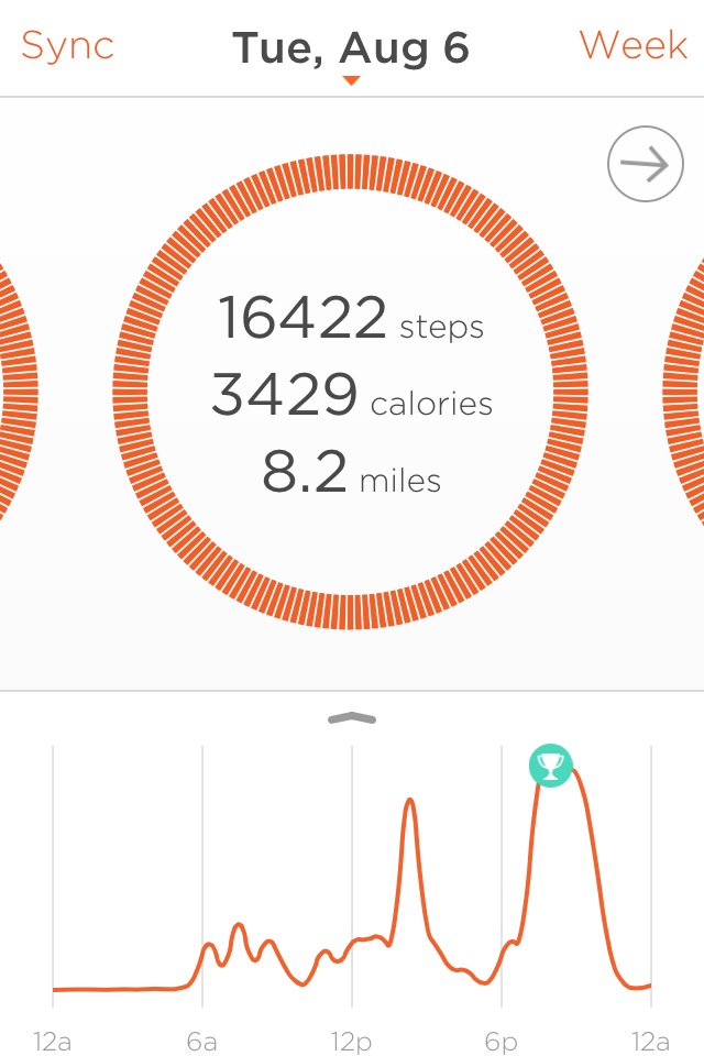
UPDATE: As I didn't (but perhaps should have) known, the Shine App can also just tell you how many steps (it thinks) you have taken. If you tap in the big orange circle for the day:

Shine Steps Detail

it expands to show the number of steps it recorded and (based on the height an weight estimates you gave it) an estimate of the number of calories your exertions burned and the distance travelled.

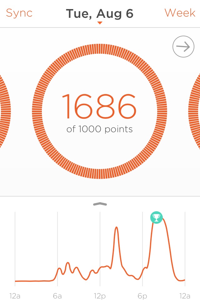
Shine Day Summary

As you can see, it isn't exactly 10 steps = 1 points, but it's close (in this case 1686 points for 16422 steps). So I guess it's adjusting for something else. I'll do another post with a summary table

As discussed in my last piece, I got the beautiful Misfit Shine Activity Tracker and have been happily using it.

When you set it up, you need to choose a daily target number of points. You get points for movement, but it doesn’t really tell you anything about the scale. It suggests three levels, which (from memory) were 600, 1000 and 1600, and it described these with fuzzy terms that were something like “kinda active”, “active” and “super active”. I chose 1,000 points.

The obvious question is: how many steps is that, and how does it relate to the widely used recommendation that people do 10,000 steps a day (e.g. the UK National Health Service; according the Horizon episode Monitor Me, this is recognized standard).

Misfit Wearables don’t really tell you, so I thought I’d measure it. I did a short walks around the block three times, taking 1630 steps the first time and 1640 steps the second and third times. (I didn’t have a pedometer handy, and didn’t really want to compare one measurement error against another anyway, so I used a counter app, Tally Counter on the iPhone and counted every 10th step. I walked a few extra steps to make it a multiple of ten each time.) It doesn’t make any difference, but I know my typical stride length is just over a yard so this walk was around a mile (1680 yards). For the first circuit I wore the Shine using the sports band on my right wrist (I was also holding the phone in my right hand and tallying). The second time I used the magnetic clip on my shirt near the neck. The third time I clipped it onto the ticket pocket on my jeans. I synchonized the Shine immediately before going out and immediately upon return.

These are the results:

Circuit Start Points End Points Points Delta Steps
First (right wrist) 162 325 163 1630
Second (neck) 325 480 155 1640
Third (jeans ticket pocket) 504 643 139 1640

The first result seems very strongly to support my guess that they are simply using 1 point for every ten steps and seems to suggest that the Shine is very accurate at detecting steps both on the wrist and on the neck. The second and third ones are slightly off, but still close to that at 10.6 steps and 11.8 steps per point respectively. Obviously I don’t know whether I got lucky the first couple of times, or whether the wrist is a better location, but I still think this data suggests quite strongly that the Shine uses 10 steps = 1 point.

One thing the Shine doesn’t seem to have is a way to export the data (either in processed or raw form) from the phone. As a data analyst, I would definitely interested in getting some kind of data export so that I could look at other things myself. It would be great if Misfit were to add this at some point.

Labels: , , ,

07 August 2013

The Misfit Shine: A Review

A long time ago I backed a crowd-funded project on Indiegogo for the Misfit Shine “the world’s most elegant physical activity monitor”. It blasted through its funding goal and suffered delays, but about a month ago they asked for a shipping address, though I don’t recall receiving a shipping notice. Nevertheless, two days ago my doorbell rang and a man from FedEx handed me a packet containing a Shine.

ShineNaked800x650

And I love it.

The Shine is elegant, beautiful even. It is understated but playful. It looks like a small, grey pebble, until you tap it twice. Then one or more of its twelve, twinkling, pure-white LEDs will shine, telling you how much you have moved today, relative to your goal. After that, in a delightful, ingenious way, the lights tell the time, to five-minute accuracy, a small antidote to the second-precision punctuality that modern life and gadgets so often seem to demand.

For me, so far, everything about the Shine is perfect. To sync it to an iPhone, you download and launch the app and then place the Shine on the phone’s screen. Activity data uploads, while the Shine puts on a light show and ripples spread out on the iPhone’s screen. It’s simple, but satisfying. One synchronized, the app shows graphs of your movements, highlights notable achievements and summarizes how you’re doing, this week, relative to a points target that you can set.

Unlike many activity trackers, the Shine uses a replaceable battery that lasts 4–6 months, so no recharging is required and you can wear it at night if you want to track sleep. It is waterproof and rugged, so you can swim with it. It comes with a simple magnetic clasp that makes it very easy to attach to clothing, and there are various watch-strap and necklace attachments too. In a touch reminiscent of the special tool Apple provides for iPhone users to open their SIM slots, the Shine comes with an elegant dedicated, tool for opening the battery compartment. (You could use a screwdriver, but it all adds to the feeling that they’re not skimping, that everything should be perfect.)

ShineStrapped950x650

Oh: and as far as I can tell, it works. I don’t know how accurate it is, but the activity graphs look to match what I have been doing well, and the granularity of information is just right. Both days, so far, it’s encouraged me to move more, and it doesn't seem as if it's going to become a burdon.

I think Misfit Wearables has got just about everything right. I hope Shine becomes a massive hit.

So what’s this got to do with Scientific Marketing?

I didn’t post this with a view to its relevance to the usual themes of this blog; I just wanted to spread the word about my lovely new toy. But in fact, it’s not so far off topic.

The main focus of this blog is how marketing is used—well and badly, for good and for ill—to attempt to change people’s behaviour. Effective marketing campaigns cause people to do things (purchase, renew, stay, click, visit) that they would otherwise not have done. Proper campaign design, with appropriate use of control groups, allows measurement of the effectiveness of marketing in changing behaviour, while uplift modelling allows us to identify the people for whom a given campaign, action, or activity is likely to be most effective.

In a marketing context, one entity (the marketing organization) is trying to change the behaviour of another (typically a customer or a prospective customer). In the case of activity monitors, the two entities are the same: I wear a Shine with the goal of influencing my own behaviour. Like many others, I know that I am less active than I should be, and would like to get a little fitter. The raison d'être for activity monitors is to encourage us to move more, by providing feedback on how we’re doing and incentives to do more.

Two days in, with only myself as a test subject, there is clearly a limit to how much I can really say about the true effectiveness of the Shine. But I think it gets a lot right.

By being small and beautiful, and pleasing to interact with, it immediately encourages us to use it, to wear it and to interact with it.

By providing only coarse information (it can show only 12 different activity levels) it discourages obsession and constant checking every few minutes (which could easily be negative), but encourages periodic checking, which is helpful.

By including a rather elegant, minimal watch function, it gives another reason to interact with the Shine, giving activity feedback along the way. Additionally, my sense is that the implicit message of the 5-minute accuracy meshes perfectly with the big-picture message of Shine itself: don’t obsess about exactly what Shine’s points measure, just try to make sure you move enough to accumulate plenty each day.

By having a non-rechargable battery that lasts for months, and being sturdy and waterproof, it encourages wearing all the time, even at night, reducing the likelihood of finding yourself without it or breaking the habit of using it.

By making the iPhone app simple and minimalist, and making the sync process artificially pleasing, it encourages frequent interaction with the app, reinforcing progress (or lack thereof).

I think the people behind the Shine have pulled off something pretty amazing, and my prediction for myself is that I won’t abandon it any time soon, and it will prove a useful tool for changing my own behaviour.

Note:

My only connection with Misfit Wearables is that I backed their Indiegogo campaign and am the proud owner of a Shine. I would love them to succeed because I think they’ve made something excellent.

Labels: , , , , ,

17 May 2012

The Not-Quite-So Amazing Case of John O'Donnell

According to the BBC (17th May 2012):

Labour MP John McDonnell has defied odds estimated at 58,000 to 1 to top the annual Private Member's Bill ballot for two years in a row.

That sounds pretty amazing. Where does that estimate come from?

In the next sentence, we learn:

MPs' names are selected at random, with 240 having entered the draw this year.

See what they've done? If we assume (as I suspect the estimator did) that 240 people entered in 2011 as well, then the probabity of Mr. McDonnell's winning in both 2011 and 2012 is indeed 1/(240 x 240) = 1/57,600.

But that's like saying "isn't it amazing that even though the odds on winning the lottery are about 14 million to 1 against, someone wins most weeks?"

I don't know how many people who enter the ballot year to year are the same, but it seems likely it's quite high. Let's assume (conservatively) that it's half. Then the odds of the same person winning in 2011 and 2012 are not 1/57,600 but 1/480.

So it should be a rare event; but not that rare.

And of course, the odds of Mr. O'Donnell's winning in 2012 were 1/240. Just as, if he enters along with 239 others next year, he'll still have a 1/240 chance of winning. That would, however, be more genuinely remarkable.

15 March 2012

Book: Getting Started With Fluidinfo

I wrote a book, with my friend and colleague Nicholas Tollervey (@ntoll). It’s published by O’Reilly Media and is available both as a printed tome and a DRM-free, multi-format electronic book direct from O’Reilly. If you use the code AUTHD at checkout, you can get a discount, as described here:

http://fluiddb.fluidinfo.com/about/book:getting%20started%20with%20fluidinfo%20(nicholas%20j%20radcliffe;%20nicholas%20h%20tollervey)/njr/image/flier.png

The book is also available from Amazon.com, Amazon (UK), Waterstones, Barnes & Noble and all good booksellers, even local ones staffed by real people who love books. Ordering direct from O’Reilly is probably quickest and lets you use the discount code.

All O’Reilly “animal” books come be known by the species on their covers: the rather striking animal on our cover is “a jellyfish-like animal of the genus Stephalia”, and you can read all about it in the book’s Colophon. The image is from Lydekker’s Royal Natural History.

For avoidance of doubt, the animal appearing on this work is real. Any resemblance to fictitious persons, animals or deities, is purely coincidental.

It is acceptable to refer to the book as “The Jellyfish Book” or the “The Stephalia Book”, but definitely not “The Flying Spaghetti Monster Book”.

13 March 2012

1-Pager Available: Customer Savability (Mobile Telco)

A new single-page description of uplift modelling in the context of retention for mobile phone companies is available from Stochastic Solutions. It aims to be the simplest, shortest description of the problem yet.
You can get it here.

Labels: , , , , ,